Expanding on the ZIRP-geo hypothesis with data, probably part 1?
TLDR: maybe venture funding data isn’t the ideal proxy but still useful to look at
I wanted to see if I could find some insight on my whole “open source geospatial web tech is a zero interest rate phenomenon” hypothesis through financial data about geospatial software companies’ funding rounds. The assumption here would be that if the hypothesis holds out then when interest rates are low, funding rounds are high, and when interest rates are high, companies don’t raise as much money.
What follows are some charts that don’t totally bear out that expectation, but also don’t dissuade me from the initial hypothesis because they sort of illustrate the variety of factors that go into VC investment decisions. Also, looking more closely at the different funding cycles of geospatial software companies is useful for thinking about the broader post-2008 recession push of Big Tech and geospatial’s position within that. (Also also, I wanted to give Observable Desktop a try—I know, I know, javascript is not a data science language you’re correct but this is very much data science for babies so I think it’s fine.)
Notes on data sources
I pulled financial data on companies from Crunchbase, interest rate data from the Federal Reserve, and CPI data for doing inflation adjustment from the Bureau of Labor Statistics. I pulled interest rate data from 1999 to present partly just to have more context for the arc of recessions; not sure if that makes a huge difference to the analysis itself but it’s kind of helpful to look at:
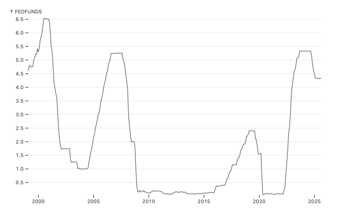
Not loving how close the current interest rate numbers seem to be to where they were right before the 2008 crash, personally!!
A caveat that becomes pretty apparent when going to look for financial data about venture-backed geospatial companies: it’s not actually going to be a lot of data points. We’re talking about a niche subset of companies that haven’t actually existed for all that long, and they’ve only done so many rounds of VC fundraising over time. There’s also the differences in types of fundraising to parse through—a “Series Insert Letter Here” round of VC investment and secondary market fundraising and debt financing have different implications for a company that, frankly, I only sort-of understand. Also, sometimes the same “Series” will span multiple months so it’ll kind of look like a company had a bad funding round but if we thought of it as part of the same round, they actually did pretty okay? I’m including annual fundraising total charts and by-type charts below for this reason.
I focused mainly on getting data from startups that specifically Did Geo Stuff—meaning, business-to-business vendors of geospatial software. This isn’t really a monolithic category, though—DeCarta and Mapbox nominally are both geo companies basically doing APIs as a service type work, but they emerge from very different contexts (among them: DeCarta started in 1996, before the dot-com crash even!). There’s also variations in exits (IPO or acquisition) and some companies that have yet to exit.
I also pulled data for Foursquare, which began as a social platform with a geospatial component but pivoted to basically being a geospatial services provider. Partly I included it because of the pivot, but also because Foursquare is a pretty good representation of geo tech in that very frothy moment in VC funding where stuff that was cool but didn’t really have a coherent business model got a bunch of money to I guess figure that out. I thought about including and maybe later will look at Uber for similar reasons, especially because Uber is sort of the exemplar ZIRP startup, but left it out for now because Uber’s funding history is sort of involved and I wanted to get something posted this week?
Looking at all of the companies’ funding over time on a single chart (adjusted for inflation) is mostly just messy and not terribly informative. (Note that Felt only has two data points despite having gone through three funding rounds; this is because the CPI data only goes up to May 2025 and Felt’s last round was in July 2025.)
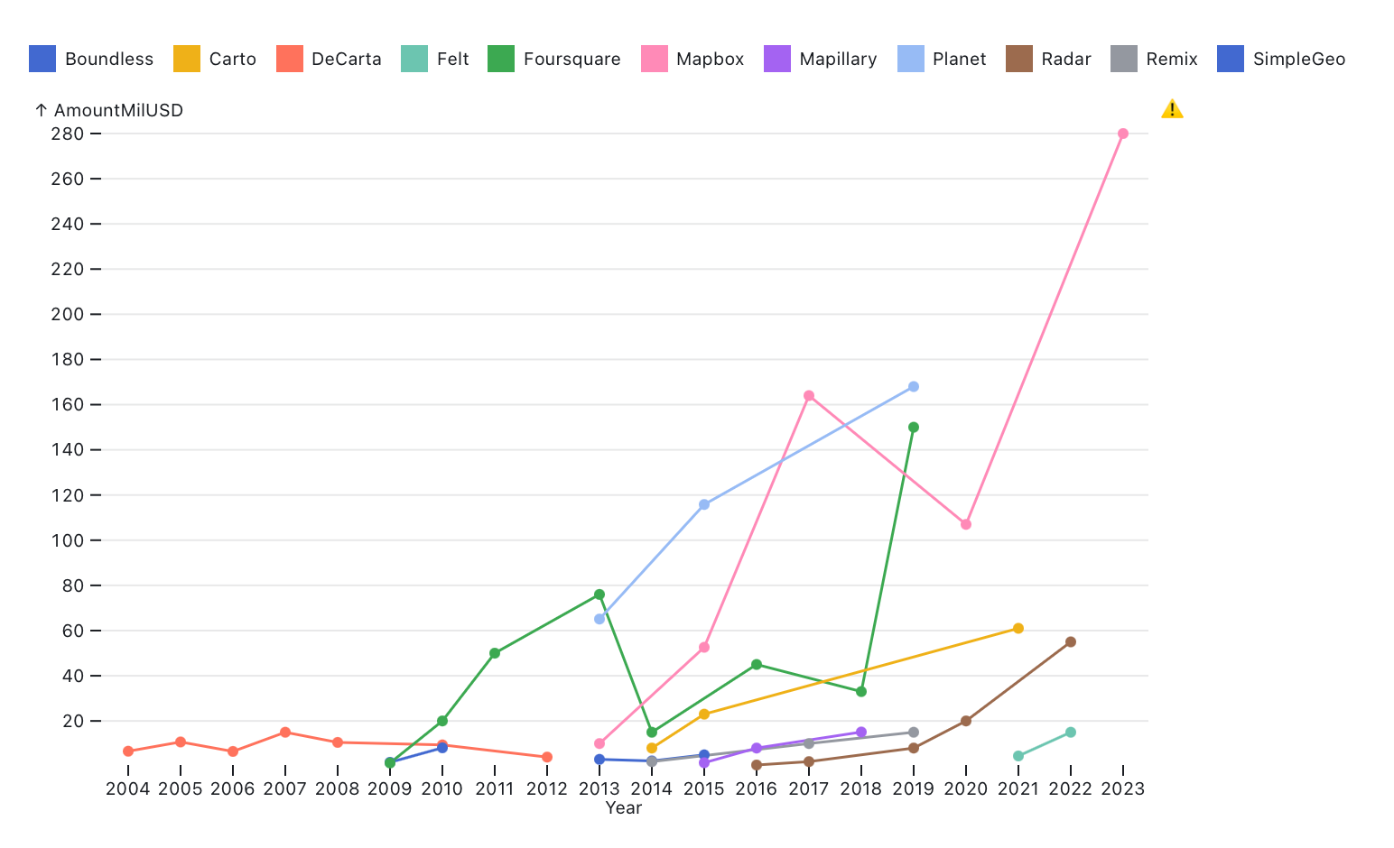
I guess it does indicate just how much more money started flowing into the space in the 2010s and what a weird time it’s been for geospatial in the midst of the whole big dumb AI tech bubble taking hold—looking at funding round announcements from geo companies from 2023 onwards, they tend to emphasize some kind of generative AI pivot. (I really, really don’t want to have to get into geo and generative AI stuff for the dissertation, it’s so depressing.)
I’m not going to do company-level analyses for every company shown in the chart above, mostly because I am trying to post something here once a week and I don’t have time to get into each one of them, also I think the point’s pretty clear from the examples below.
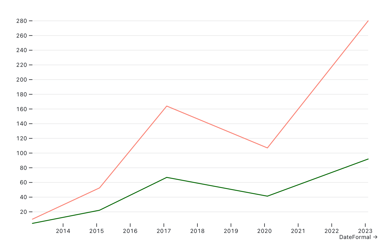
Mapbox
The “all the companies” chart gets really heavily skewed by Mapbox’s 2023 funding round, but looked at in isolation it’s actually not that dramatic of a jump for Mapbox itself. Salmon is the total raised, dark green is that amount adjusted for inflation (both in millions USD):
Here’s the adjusted-for-inflation funding rounds normalized (as in, brought down to values between 0 and 1) and federal interest rates normalized together:
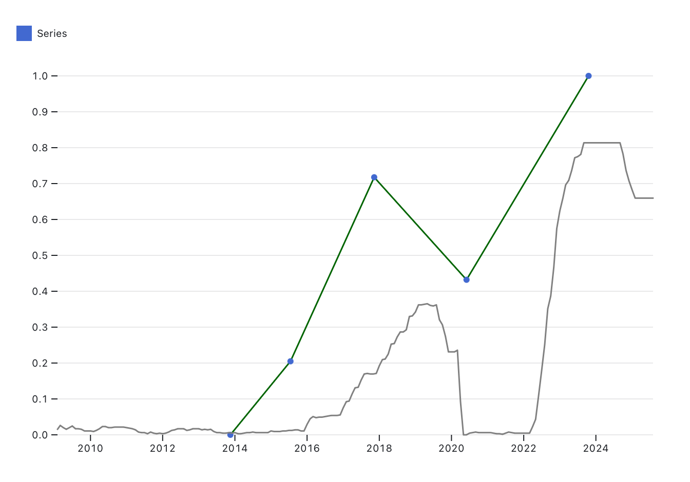
Probably should have used a normalized subset of interest rates within the bounds of Mapbox’s funding rounds but I don’t think it would make that big of a difference to the result, which is that we seem to have a repudiation of the ZIRP hypothesis here. If anything, Mapbox seems to get way more money as interest rates climb.
We could consider Mapbox subject to the SoftBank exception—a thing I just made up based on the observation that SoftBank is a deeply irrational investor and tends to overvalue companies that it invests in. Softbank led Mapbox’s 2017 funding round and were the sole funder in their 2023 round. I wonder if Premji Invest would have been inclined to invest hundreds of millions into Mapbox in May 2020 absent the SoftBank round.
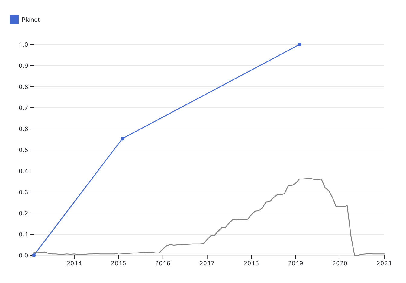
Planet
When you look at Planet’s various fundraising incidents separately on a normalized line chart, it looks like they had some crazy drop in valuation:
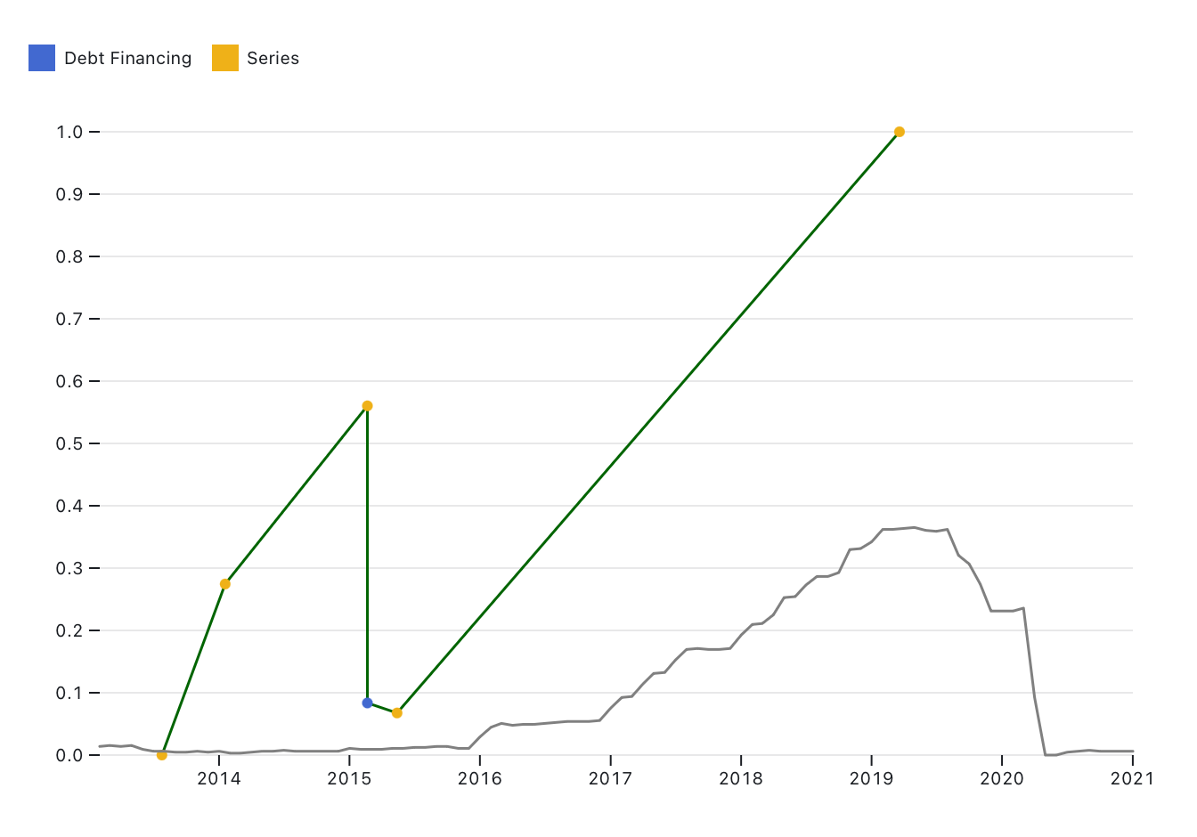
But it’s actually that in 2015 they did some debt financing and then their Series C was split into two separate announcements, one $92.8 million and one of $23 million. This is what it looks like if we just look at annual funds raised:
(Also, in 2013 they did their Series A and Series B which I combined in the above chart.)
Planet did raise a fuck ton of money from one big investor a couple of years after Mapbox’s big Softbank round, but it makes a bit more sense for a company like Planet to raise that much money because they have really intensive capital costs (they make hardware that goes into space) and as primarily government contractors remote sensing companies just have a much more obvious, legible pathway towards a successful exit than Mapbox does.
Carto
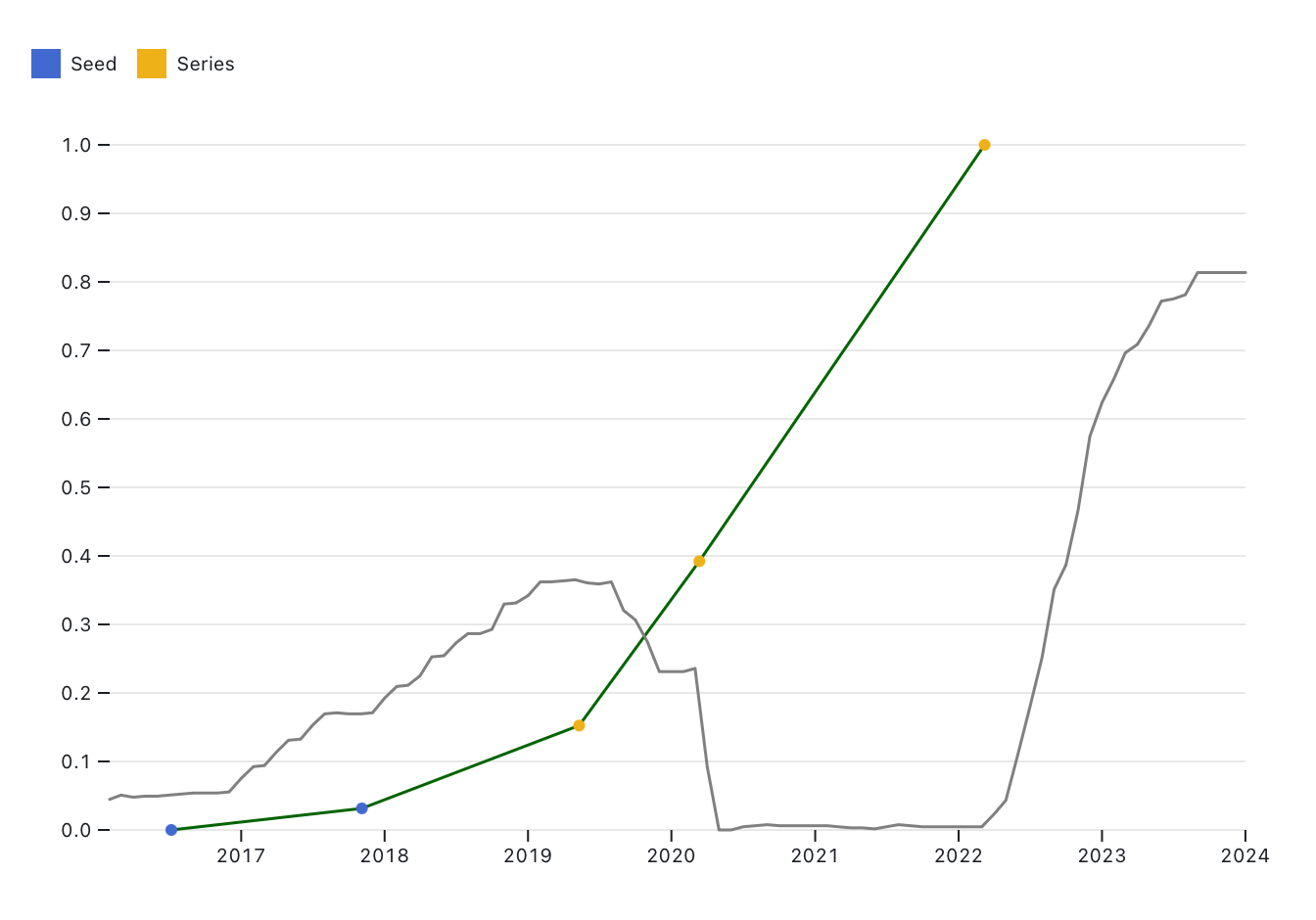
Carto comes closest to telling a pretty overt ZIRP story (interest rates crater, funding total up) but this happens with exactly three data points, so it feels weird to claim it as strong evidence. It does have me sort of wondering how the hell Carto has remained solvent over the last several years? Migurski’s there now and talking to him about their current strategy makes me think they have a shot of at least figuring out a reasonably sustainable future, but totally unclear to me how they kept afloat the rest of the time.
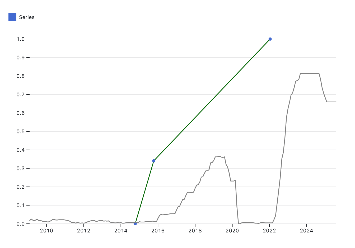
Another company whose trajectory has a visibly ZIRP-y trajectory is Radar, which I don’t know very much about but sort of feels like “what if Mapbox hadn’t had a cute open source origin story” and has had a similar trajectory in terms of how much they’re raising in their first few years.
Foursquare
In 2013 Foursquare did some debt financing and then did a Series D that technically took place over late 2013-2014. I can’t really decide if it makes more sense to combine the Series D or not, because it makes it look like Foursquare had a super-precipitous year-to-year drop when it was maybe more like a moderate drop:
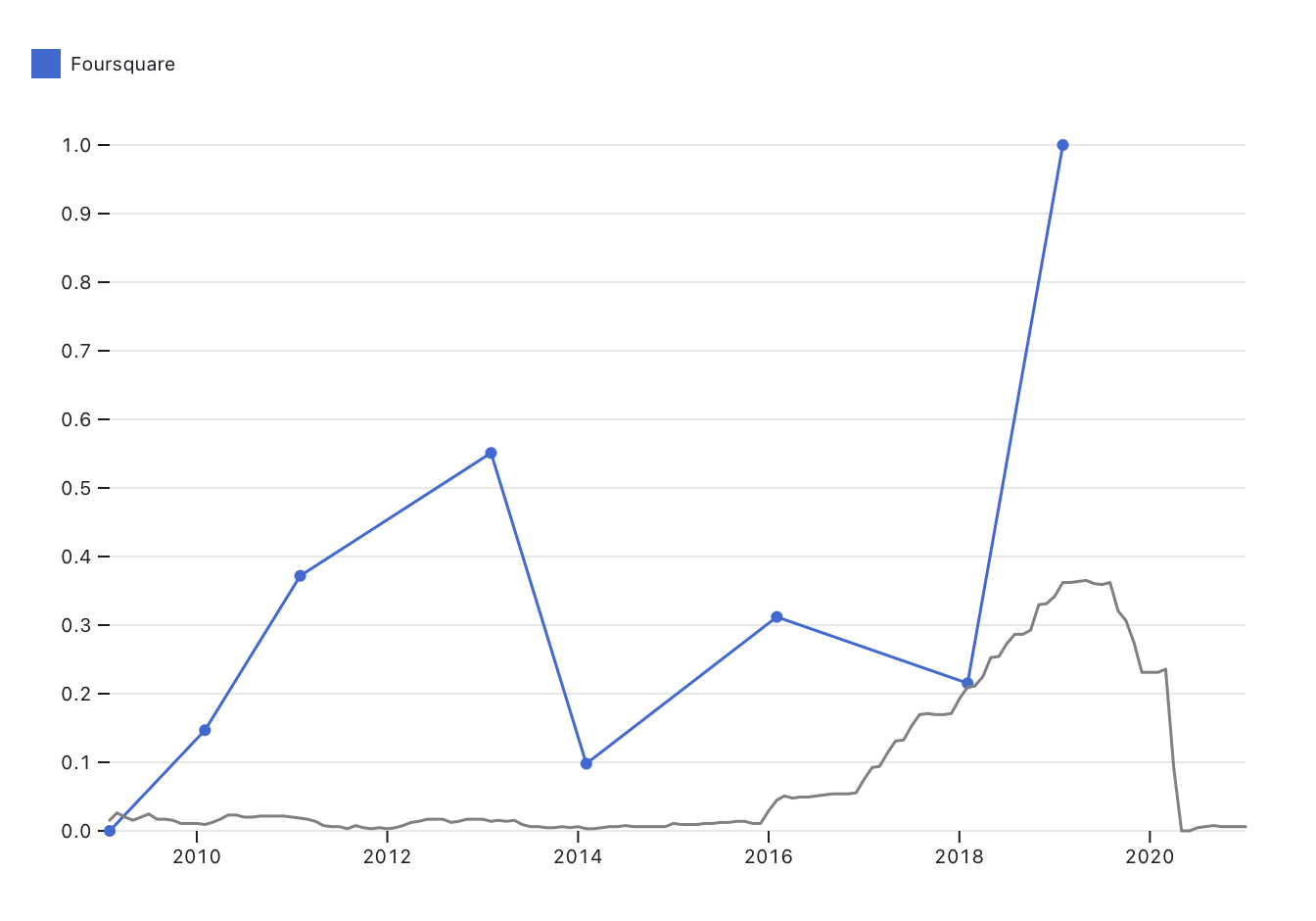
It actually is a little more reasonable when viewed as fundraising events over time, though there’s still that weird part-of-a-Series-D drop:
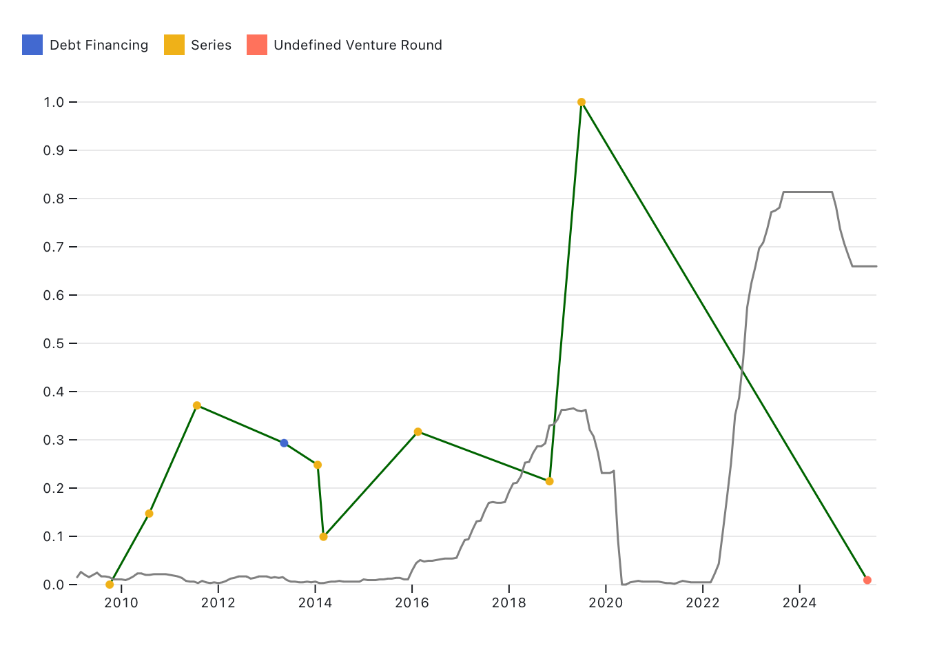
(The big drop in 2025 isn’t in the annual comparison because I don’t have an annual CPI number for 2025. It’s a weird $3.8 million that looks more like it was loaned to Foursquare than a meaningful VC investor swooping in; honestly I’m not sure what’s going on there.)
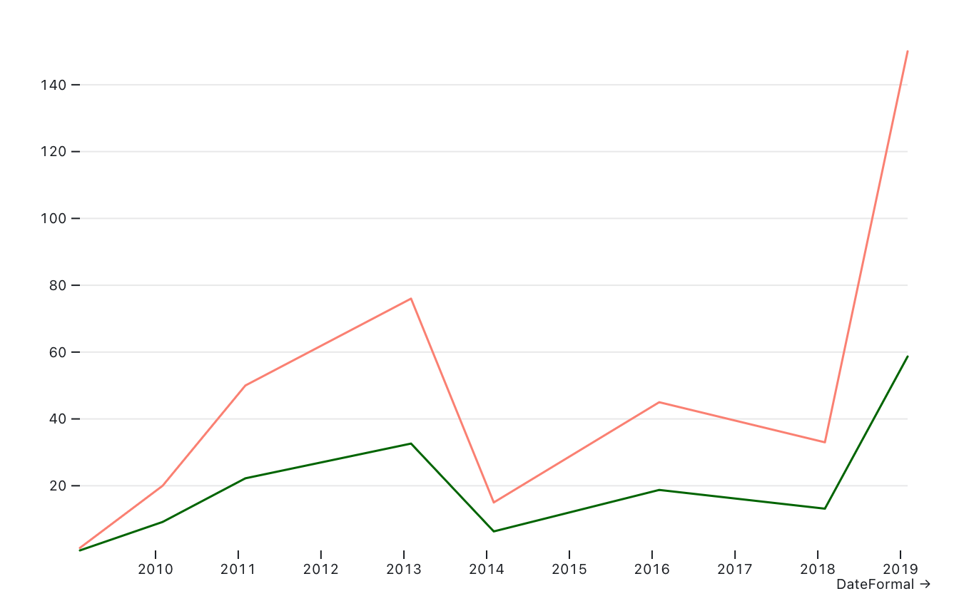
In 2019 Foursquare raised $150 million from a single investor, The Raine Group. Coverage of the funding round tends to also mention Foursquare’s acquisition around the same time of Placed, a subsidiary of Snap which offered a competitor product that Foursquare wanted. It’s not clear if part of the reason Raine threw down that much money was specifically for the purposes of acquiring Placed, but it might make sense. Even comparing for inflation, going from like a tens of millions raised company to that is kind of weird (pink unadjusted, dark green adjusted):
What else/next steps
So yeah, I don’t think this was totally a waste of time but I also am more sympathetic to the “IDK man” response that I’ve received from some of the longtime geo people when I’ve put forward the ZIRP hypothesis. World-historical forces do not always make themselves so obvious in people’s day to day lives, but you’d think that following the money would tell us more. I am to some extent trying to translate a vibe into something more empirical, and it’s hard to identify a big macroeconomic event in the lower-level economic context of a niche sector.
These are some of the ideas I’ve got for trying other framings with this data or seeking out other data:
Number of investors in a round relative to amount raised: Mostly this is a very limited proxy for “is it a bubble” and/or “does someone just have way too much money”—before 2017-ish you don’t really see the single VC firm coming in with hundreds of millions of dollars for a funding round in geo, and while it’s not like it becomes wildly commonplace there is something maybe notable about the fact that most of the hundred-millions scale funding rounds in this data are the work of one company as opposed to the earlier 2010s tendency towards tens of millions from 4-6 backers.
Valuations of geo startups/the gap between those valuations and the valuation of geo as a sector. This is something that a nice Park Slope dad VC explained to me a while ago that sort of fucked me up, which is that most of the “valuations” of companies extrapolated from fundraising deals are mostly vibes? Like from a VC’s perspective, if they invest $2 million into a startup their expectation is that they will, at a minimum, get $2 million back at some point. It’s not that the company is “worth” $20 million on the basis of getting x number of shares at $2 million or whatever. (Which makes me wonder if economics the real vibe coding all along…) I think that fundraising is a more concrete data point to work with and it’s harder and more annoying to hunt down valuations, but the opacity of how much geo is “worth” is kind of important to the broader “maps don’t actually make money” thing.
Ideas for less conventional metrics of ZIRP-ness: One way to understand ZIRP as a moment is to look at different kinds of “superfluous” or at least seemingly lower ROI spending that took place in that timeframe. Who was sponsoring (or hosting) geospatial conferences? Who was sponsoring specific geospatial open source projects and/or conferences? How have those commitments changed over time? Headcounts are harder to get time series data on; layoffs could be engineered from news coverage and/or social media maybe.
Honestly feeling a little bit insane here, doing my little maths while the world burns. Dissociating is an effective coping strategy until it’s not!